Creating “key art”, the visual representation of a musical used in marketing, is a crucial step in the development process of a new show. Let’s break down some Broadway key art and learn how choosing the right colors is essential to capturing the essence of the production.
Psychology of Color in Marketing
Color is useful in marketing because it can influence how people feel about a product or brand. It’s been proven time and time again that people have common reactions and emotional impressions from certain colors, which is why it is such an important consideration when creating a brand, product, or logo.
Here are some common colors and the responses they evoke:
- Red is associated with passion, excitement, and urgency. It can increase heart rate and blood pressure, making people feel more alert and energized. It is also associated with love and romance.
- Blue evokes calmness and serenity, but can also be indicative of sadness or depression.
- Yellow is associated with happiness, optimism, and warmth. It can evoke feelings of joy and cheerfulness and is often used to create a sense of optimism and positivity.
- Green is connected to nature, growth, and balance. It can have a calming effect and is often used to create a sense of tranquility and harmony. It is also associated with wealth and money.
- Purple is associated with creativity, luxury, and spirituality. It can have a soothing effect and is often used to create a sense of sophistication and elegance.
- Orange reflects enthusiasm, energy, and excitement. It can evoke feelings of warmth and playfulness and is often used to create a sense of fun and enjoyment.
- Pink is traditionally associated with femininity, sweetness, and romance. It can evoke feelings of tenderness and nurturing and is often used to create a sense of intimacy and love.
Examining Color in Broadway Key Art
Being intentional about how color is used can help reinforce the tone and themes of a musical. Not only is this useful in designing key art, but set designers, costume designers, and lighting designers all work together to use color as a powerful storytelling tool.
Consider how the following colors are used in the key art (as well as costumes, set and lighting) of popular Broadway musicals to represent their unique themes and characters.
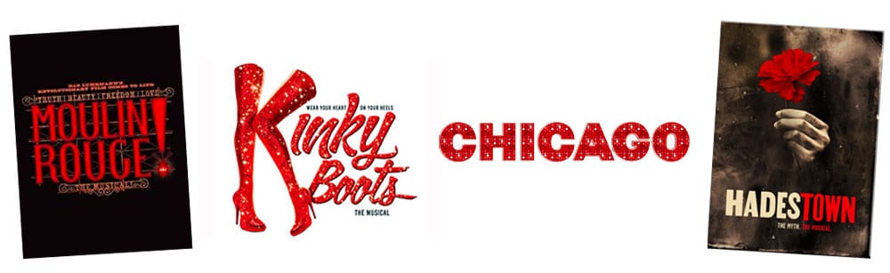
Colors in Broadway Key Art: Red
- Chicago uses a classic combination of black and red to capture the glamorous, seductive, and dangerous tone of the musical. The use of red in particular is highly effective, as it conveys the passion and intensity of the characters and the world they inhabit.
- Moulin Rouge: The Moulin Rouge, the iconic Parisian nightclub that serves as the setting for the show, is known for its red velvet curtains and decor. Red is used throughout the show to represent the club’s passion and allure.
- Hadestown: Red is used prominently in the key art for Hadestown to convey the show’s themes of passion, danger, and love. Additionally, the use of Hades’ fiery red throne and the red flowers further reinforce the emotional themes and atmosphere.
- Kinky Boots: In the Kinky Boots key art, the use of red represents the vibrant and bold nature of the show’s themes of self-expression and acceptance. The red boots worn by the characters also serve as a symbol of empowerment and individuality, further reinforcing the show’s message.
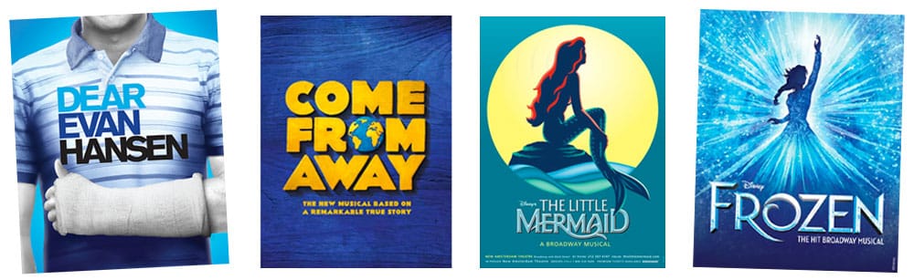
Colors in Broadway Key Art: Blue
- Frozen: Blue is a central color in Frozen, representing Elsa’s ice powers and the icy setting of Arendelle. The show’s key art often features Elsa in her signature blue dress.
- Dear Evan Hansen: Blue is used prominently in the Broadway musical “Dear Evan Hansen” to represent the character of Connor Murphy, who dies by suicide early in the story. Throughout the show, blue is used to symbolize Connor’s presence, his memory, and the impact of his death on those around him. The shades of blue in the title treatment are also seen in Evan’s various shirts throughout the performance.
- The Little Mermaid: Given the show’s aquatic setting, blue is a prevalent color used in the production’s costumes, set design, and lighting.
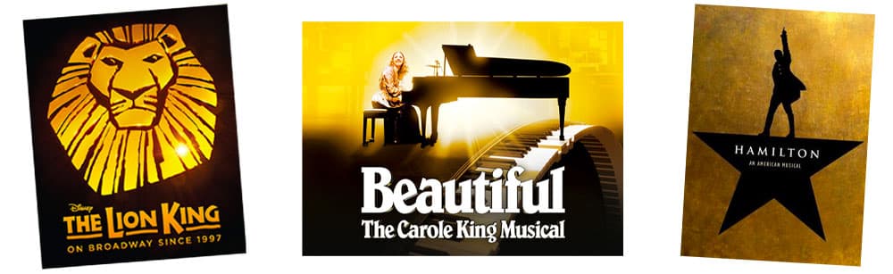
Colors in Broadway Key Art: Yellow / Gold
- The Lion King: The Lion King branding—both on stage and film—features an earthy color palette that evokes the African savannah setting. The use of natural tones like orange, yellow, and brown creates a sense of warmth and familiarity while also conveying a sense of adventure and wonder. The stage musical key art has evolved to also include a shiny gold which adds a regal element to the brand.
- Hamilton: The Hamilton key art features a striking combination of black, gold, and white. The black and white create a sense of contrast and drama, while the gold adds a touch of elegance and power. The use of gold is especially effective in this design, as it conveys the wealth and power of the historical figures depicted in the musical.
- Beautiful: The Carole King Musical: The use of yellow in Beautiful: The Carole King Musical is a deliberate choice that helps to establish the show’s identity and appeal to audiences who are fans of Carole King’s music and the pop culture of the 60s and 70s. The color conveys a sense of warmth, joy, and nostalgia that is in keeping with the show’s upbeat and optimistic tone.
- Come From Away: The use of yellow in the title treatment for Come From Away may be intended to suggest a sense of warmth, hospitality and welcome. Yellow is often associated with warmth and hospitality, and the use of this color in the logo helps to convey the sense of community and support that the people of Gander offered to the stranded passengers.
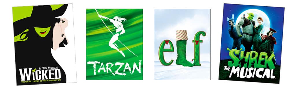
Colors in Broadway Key Art: Green
- Wicked: The key art for Wicked uses a bold combination of green, black and white. The green represents the wicked witch Elphaba, while the white represents the good witch Glinda. The use of these contrasting colors shows the high contrast between these two main characters. The green, which obviously reflects Elphaba’s green skin, can also represent “will” and “envy” which are also unique themes in the show.
- Elf: The use of green in the key art for Elf the Musical evokes a sense of holiday cheer and whimsy, while also reflecting the costume of the central character of the show—Buddy the Elf.
- Shrek: Similar to Wicked, the key art for Shrek the Musical uses the color green, which represents the color of the lead character’s skin.
- Tarzan: The key art for Tarzan the Musical has a green background, indicative of the forest where Tarzan lives.
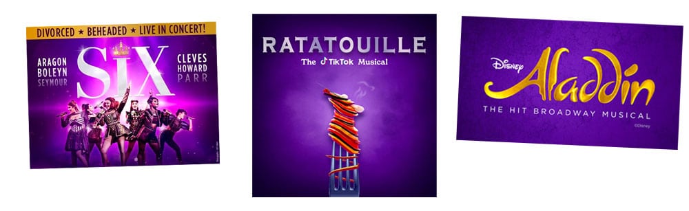
Colors in Broadway Key Art: Purple
- SIX: Purple has long been associated with royalty and nobility, as it was historically a difficult color to produce and was therefore reserved for use in the clothing and accessories of the wealthy and powerful. By using purple in the key art, the designers were able to create a sense of regal authority and sophistication, while also hinting at the show’s themes of female empowerment and strength.
- Aladdin: Purple is often associated with royalty, luxury, and magic, and its use in Aladdin helps to create a sense of wonder and enchantment. Purple is also associated with the character of Genie, who is a key figure in the musical. In the Disney animated film on which the musical is based, Genie is famously blue, but in the stage production, the character is portrayed by a purple-clad actor. This choice may have been made to give the character a more regal and powerful appearance, while also linking him to the magical and mystical elements of the show.
- Ratatouille: The TikTok Musical: Purple is often associated with creativity, imagination, and innovation, which are all key themes in Ratatouille: The TikTok Musical.
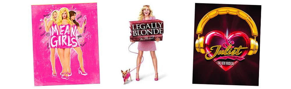
Colors in Broadway Key Art: Pink
Pink is often used in Broadway shows to represent femininity, romance, playfulness, and sweetness. Examples include:
- Legally Blonde: Pink is a central color in Legally Blonde, representing the main character Elle Woods’ signature color and personality. The show’s key art often features Elle in a pink outfit or against a pink background.
- Mean Girls: The use of pink in Mean Girls can serve as a symbol of superficiality, while also highlighting the contrast between conformity and individuality. It also helps to establish the show’s identity and target audience.
- & Juliet: & Juliet, a pop-infused reimagining of the story of Romeo and Juliet, uses pink in the show’s set design, costumes, and marketing materials, helping to establish the production’s identity as a modern and upbeat take on the classic tale of young love.
Considering Color When Creating Your Musical’s Key Art
Creating key art for a new musical is a crucial part of the marketing process, as it can help to capture the essence of the show and attract potential audiences. Choosing the right colors for the key art can be especially important, as different colors can evoke different emotions and associations in viewers.
Consider the themes and tone of the musical
The first step in creating key art for a new musical is to consider the themes and tone of the show. What emotions do you want to evoke in potential audiences? What are the key themes and messages of the musical? For example, if the musical is a high-energy, feel-good show with a lot of humor, you might want to consider using bright, bold colors like yellow or orange in the key art. On the other hand, if the musical is a more serious, introspective show with a lot of emotional depth, you might want to consider using more muted, subdued colors like blue or green.
Think about the characters and setting of the musical
Another important consideration when creating key art for a new musical is the characters and setting of the show. What colors are associated with the characters or the setting? For example, if the musical is set in the 1920s, you might want to consider using gold or black in the key art to reflect the glamour and elegance of the era. If the main character is a fiery, passionate performer, you might want to consider using red or orange to reflect their personality and energy.
Experiment with different color combinations
Once you have a sense of the themes and characters of the musical, it’s time to start experimenting with different color combinations for the key art. Try combining different colors and shades to see what looks best and evokes the right emotions and associations. For example, you might try combining shades of blue and purple to create a moody, introspective feel, or combining gold and red to create a sense of power and energy.
Consider the use of contrast and negative space
Another important consideration when creating key art for a new musical is the use of contrast and negative space. Contrast can help to make certain elements of the key art stand out and draw the viewer’s eye, while negative space can create a sense of balance and clarity. For example, you might use a dark background with bright, bold lettering to create contrast and make the title of the musical stand out.
Get feedback and iterate
Finally, once you have a few different versions of the key art, it’s important to get feedback from others and iterate on the design. Show the key art to people who are familiar with your musical and ask for their honest opinions. Use this feedback to refine and improve the design, making sure that it accurately reflects the themes, characters, and tone of the musical.
In conclusion, creating key art for a new musical is a highly nuanced and complex process that requires careful consideration of color associations, themes, characters, and design principles. By taking inspiration from existing Broadway key art and experimenting with different color combinations, you can create key art that captures the essence of your musical and attracts potential audiences. Remember, the right colors can evoke powerful emotions and associations in viewers, and can be the key to a successful marketing campaign.
Need help creating your key art? Email me here!
Also check out part one of this series: “Breaking Down Broadway Key Art: Fonts.”