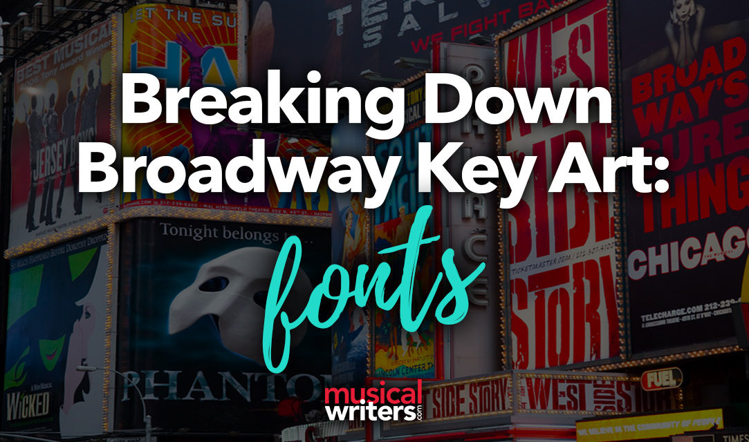
Think of any Broadway musical you’ve seen, and most likely the key art (the show’s brand image) is one of the first things that comes to mind. Whether it’s on a Playbill cover, a Times Square billboard, atop a taxi, or on your favorite t-shirt, the key art is the visual trigger that ticket buyers associate with a show.
Unless you’re in the design or advertising business, you may not have ever thought about what goes into creating a show’s key art and title treatment. As a graphic designer, my everyday tasks involve the visual communication of a concept, brand, or message. In designing Broadway theatre key art, there are very specific and intentional choices made which all work together to establish and communicate the product, business, or musical’s desired message and voice.
Design Elements
In the article series, “Breaking Down Broadway Key Art,” we’ll take a look at well-known Broadway shows and examine their key art or title treatment’s unique design elements including:
- Fonts
- Colors
- Iconography (Photos/Illustrations/Icons)
- Background (Theme/Setting)
- Copy (Taglines and Headlines)
Let’s start with Fonts.
Broadway Key Art Fonts
Designers are very intentional when choosing fonts for Broadway theatre key art. Each has a unique function and exudes a specific style and mood.
What’s the Difference in a Typeface and a Font?
While most people use the terms “typeface” and “font” interchangeably, they are actually not the same. A typeface is really the “font family,” such as Helvetica, Times, Bodoni, etc. A “font” is more specific and provides the details of usage. If someone asked me what typeface I was using for this site’s article text, I would say “Lato.” If they asked about the font, I would say “12pt Lato Regular.” However, for ease of use, I’ll be referring to all as “fonts.”
Font Classifications
Most typefaces can be classified into one of four basic groups: serif, sans-serif, script and decorative/hand-lettered. Each has a unique history and look, and each exudes a specific style or mood. Most Broadway show art is either serif, sans-serif, or decorative. Script fonts don’t translate well visually, so those are not often used. Here are a few examples:
Serif Fonts
A serif is a decorative stroke that finishes off the end of a letter’s stem. A serif font is a font that has serifs, while a sans serif is a font that does not.
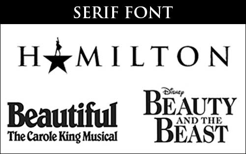
Serif fonts are sophisticated, historical, elegant, and exude authority. Well established, traditional stories often use a serif font in their title treatment. Broadway show examples using a serif font in their title treatment include:
- Hamilton
- Beautiful: The Carole King Musical
- Beauty and the Beast
- Legally Blonde the Musical
- Evita
- Six
- The Phantom of the Opera
Notice how many of these are either historical, corporate, or political in nature.
Sans-Serif Fonts
While serif fonts focus on embracing tradition and history, sans serif fonts take the opposite approach and embrace simplicity and modernism. Sans-serif fonts are clean, casual, and approachable, and tend more towards youthfulness.
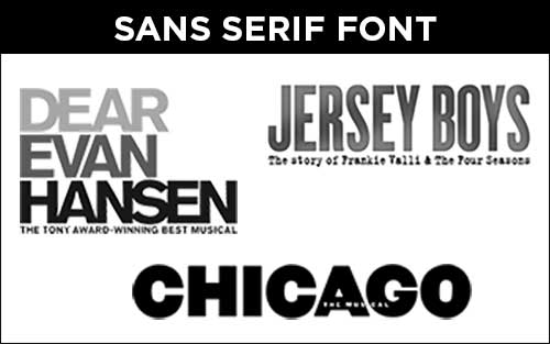
Examples of key art using sans-serif fonts are:
- Dear Evan Hansen
- Jersey Boys
- Chicago
- Caroline or Change
- The Book of Mormon
- Avenue Q
Script Fonts
Script fonts can either be calligraphic and uniform in nature or looser and in a more handwritten style. Because script fonts can sometimes lose their visual integrity and readability when scaled at different sizes, they are not too commonly used in title treatments.
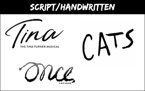
Shows using script or handwritten fonts in their key art are:
- Tina: The Tina Turner Musical
- Cats
- Once
- Flying Over Sunset
- Oh! Calcutta!
Decorative Fonts
There’s a wide gamut of decorative fonts ranging from elegant and sophisticated to playful and casual — and everything in between. These fonts were created to reflect certain eras (e.g. medieval times, roaring 20’s, 1960’s), geographical regions (Old West, California, Las Vegas), events (Christmas, circus), genres (horror, sports), and artistic movements (Art Nouveau, Art Deco).
If your show has a strong influence in one of these areas, using a decorative typeface can help establish the style or era associated with the show.
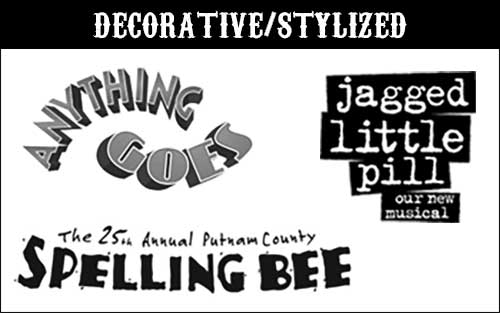
Shows using decorative fonts include:
- Anything Goes
- Jagged Little Pill
- The 25th Annual Putnam County Spelling Bee
- Newsies
- Memphis
- Ragtime
- West Side Story
- Hairspray
Custom Broadway Key Art Fonts
Some shows hire artists to create custom type treatments that give a unique, original feel to the logo and set it apart from all others. This can be done by substituting an image or graphic for one of the letters, by modifying each letter to fit an iconic shape, or by hand-illustrating each letter individually so the final result is a one-of-a-kind piece of art. These are by far my favorite designs, as they require a unique eye and extra bit of creativity to craft the letters into a storytelling tool.
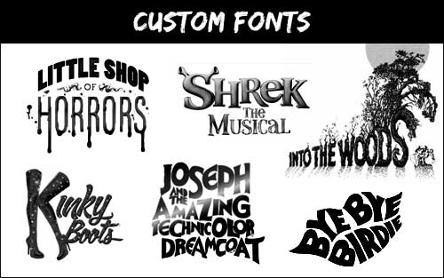
Shows using custom or hand-illustrated fonts include:
- Little Shop of Horrors
- Shrek the Musical
- Into the Woods
- Kinky Boots
- Joseph and the Amazing Technicolor Dreamcoat
- Bye Bye Birdie
- Mean Girls
- Pippin
Your Turn!
Which of these font categories are you most drawn to to best represent your story, time, and feel? Have a favorite show poster? Tell us what you love in the comments below!
Need a title treatment, logo, key art or website for your show? Email me at hollyr@reedcreativegroup.com and let’s get it going!